
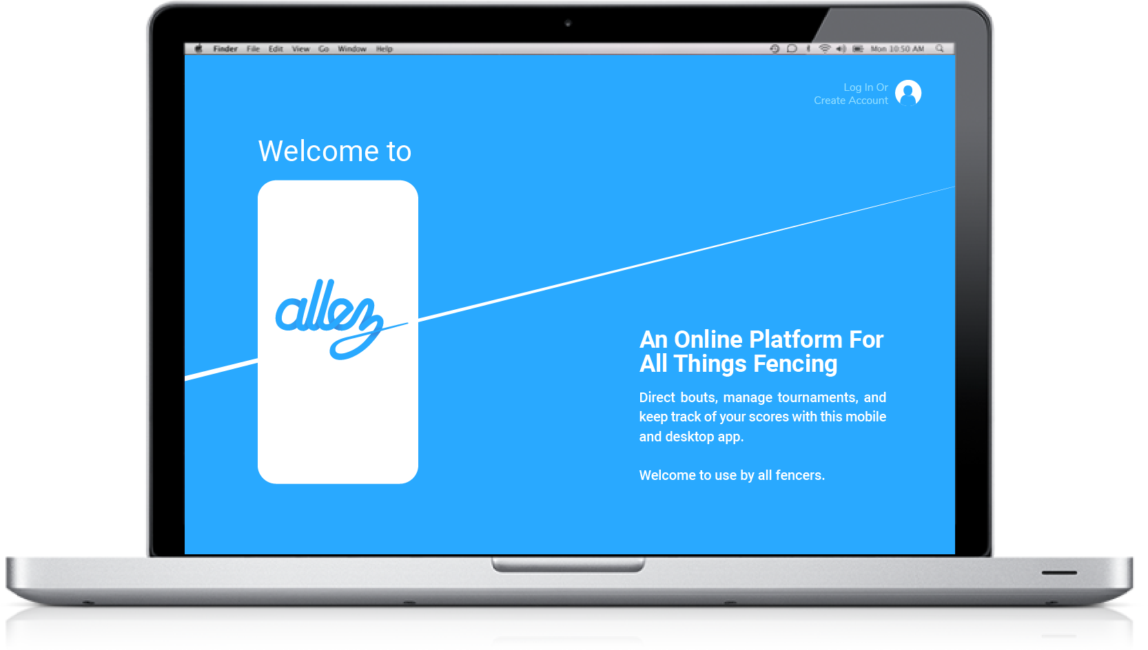
Allez is a French term that is commonly used in fencing, that means "go!". This app is a fencing scoring and tournament organizer, giving smaller grassroots groups the ability to host events with ease. Fencing tournaments are traditionally run on a paper system that requires tournament organizers to quickly navigate around to get scores to the admin in a timely manner. This app provides a solution to this problem, as well as allowing individual players and coaches to track and record their own progress.
Premise
In college when I joined a fencing club, my friends and I would talk about how there was a lack of comprehensive scoring apps for fencing, and that the current fencing tournament system was antiquated. The standard system is paper-based, and is commonly the bottleneck for tournament efficiency. We discussed how we could create our own app that could surpass the bare bones apps that currently exist. I decided to design a fencing app that can record individual fencing bouts, and that could also work as a tournament organizer, two of the most important functions an individual and group respectively require.
User Stories for Director, Admin, and Player users.
Surveys
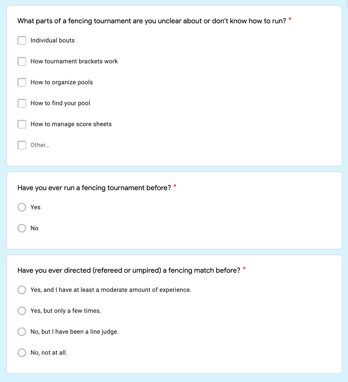
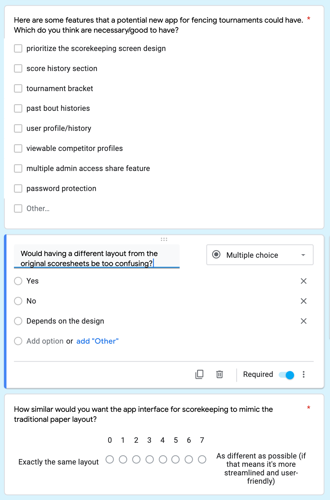
Creating a tournament app means catering to the perspectives of tournament administration, coaches, directors (referees), and novice players at the same time, so I gathered basic information about what each demographic knows and wants from scorekeeping. I posted my survey questions on Google surveys and collected as many responses from the fencing collegiate community as possible. I decided to focus on a college audience specifically, because that was what I understood already, and what seemed reasonable to focus on, as other groups have much different age ranges and rankings to consider.
Background Info

Current Scoring System
User Preferences
Initial Sketches
Here are some of the original thumbnails and paper prototypes that I created. I focused on the scorekeeping screen the most, as their functioning in a timely manner is the most imperative. Fencing (like other sports) can have complicated aspects to scoring that depend on player positioning, priority, and how many cards they have received for rule-breaking. On the other hand, as a close-combat sport, fencing ruling can be over in seconds so the scorekeeping screen needs to be very simple for the ref to use while refereeing. I decided to break up the screen into two phases: active and inactive. The inactive screen is the initial stage with all of the information, which switches to an active screen once the timer button is started. When the timer is stopped, the inactive screen returns for scoring information to be added.
Two versions of how I imagined the timer, active and inactive.
Site Map
Then came the problem of combining the timer with the rest of the app. Because this app needs to work for both individual matches and fully-organized tournaments, the app must cater to various viewpoints: that of the tournament administrator, the match director, and the average fencer. Fencers often have to act as directors for other fencers at practice and in tournaments so they must be able to record matches for themselves and others. Therefore, the interface options may seem redundant across certain topics, but that is to account for the different aspects the standard user needs to cover.
Rough Drafts
From this point I drew sketches and then digital mockups of all of these screen stages. I created at least two different versions of each screen and compared them side-by-side along with the other screens. The diagram below shows the corresponding screens after initial sketches. By this point I had begun to develop the graphic design aesthetic of the app.
Moodboard
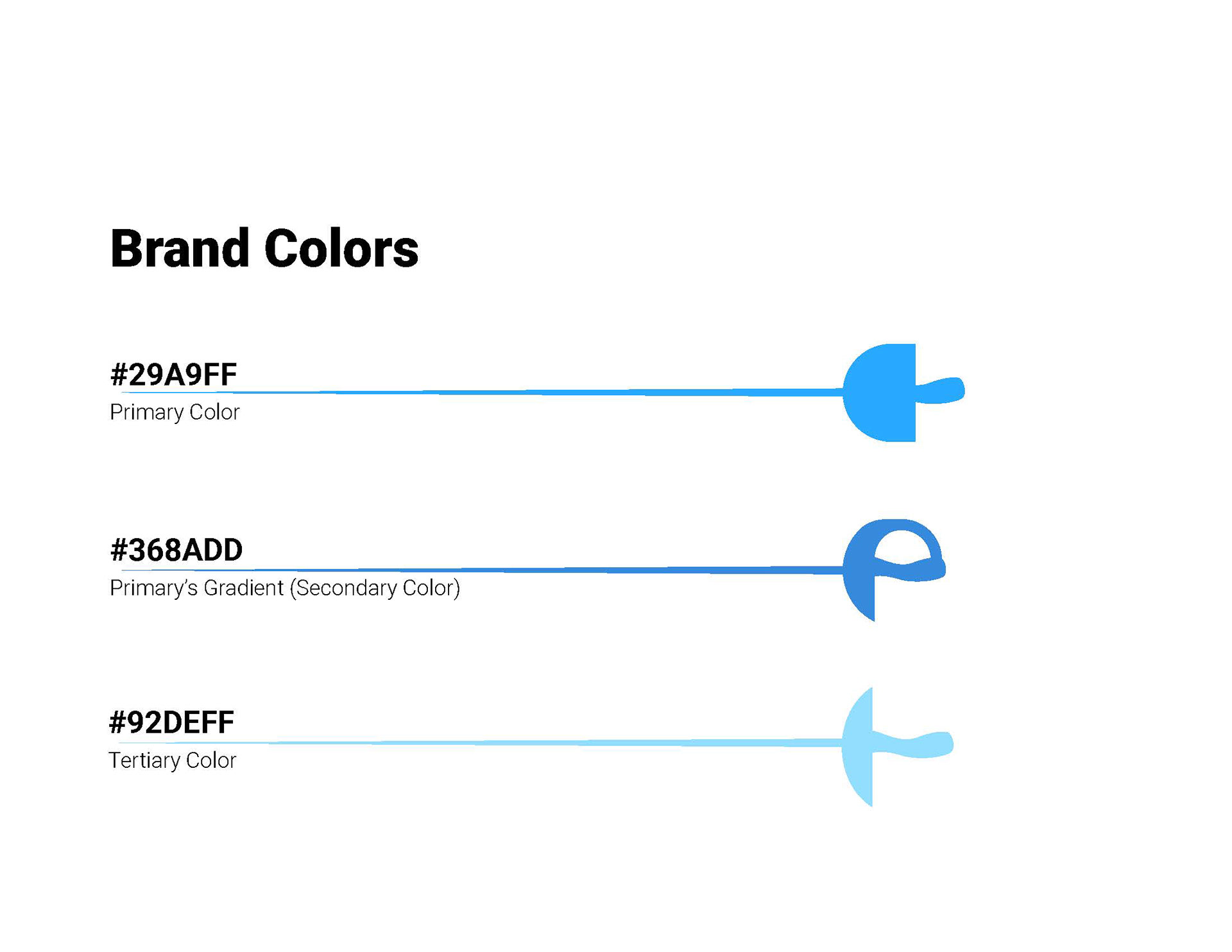
Before tackling the visuals for the Allez brand, I created a mood board regarding fencing aesthetics and equipment. The colors mainly besides black and white are green, red, and blue. Because the first two are used for scorekeeping, I decided that blue would be an ideal main color for the app.
Creating the Logo
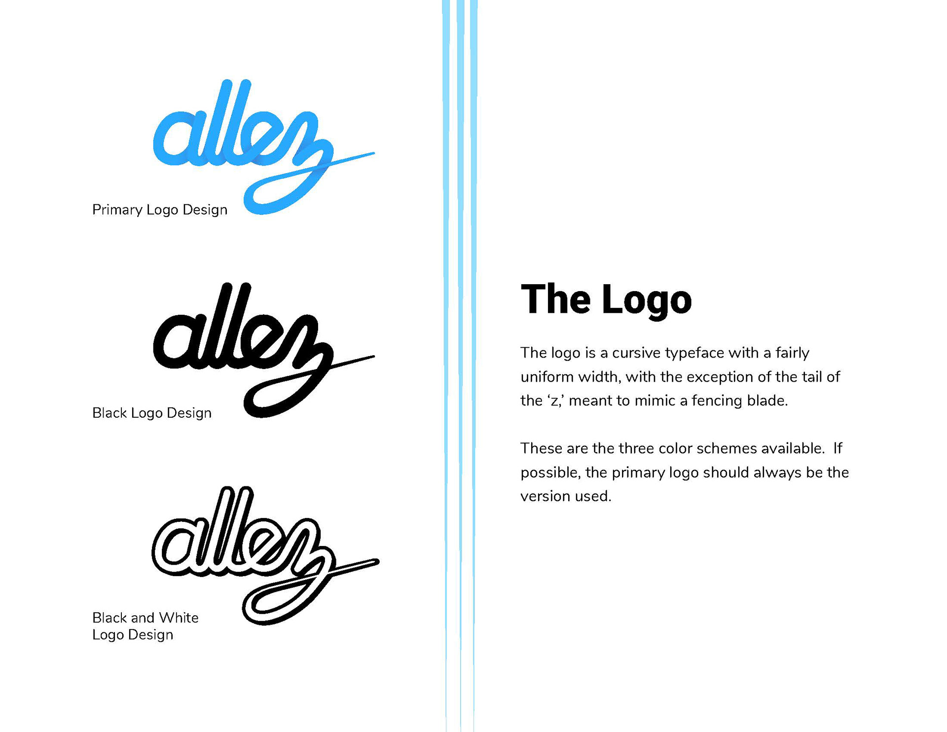
Originally, I considered several name options for this app, so some of the logo sketches I created had no name associated, like the timer that has swords for clock hands (bottom left). I was a fan of this idea but had to let it go because the swords' visibility drastically decreases at smaller sizes. After deciding on the name because of its enthusiastic, optimistic vibe, I tried sketching logos that reflect that. The logo directly below reflects the gung-ho attitude that the phrase conveys, but again, the thinness of the fencing blade is too extreme for smaller versions. I also played with the idea of a narwhal mascot (bottom right) that would guide users through the UI for the first time. Eventually I decided that having the simplest design would detract less from the overall usability.
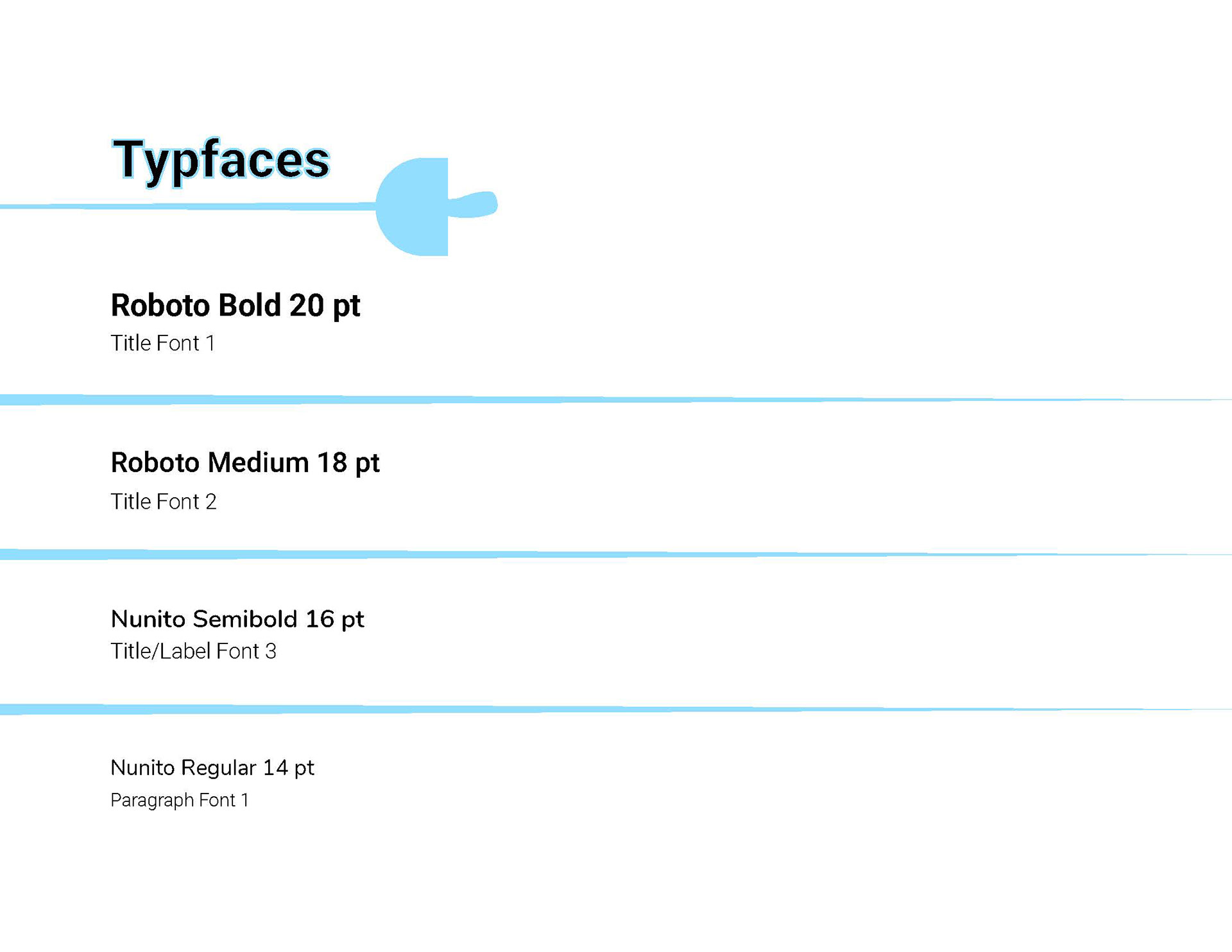
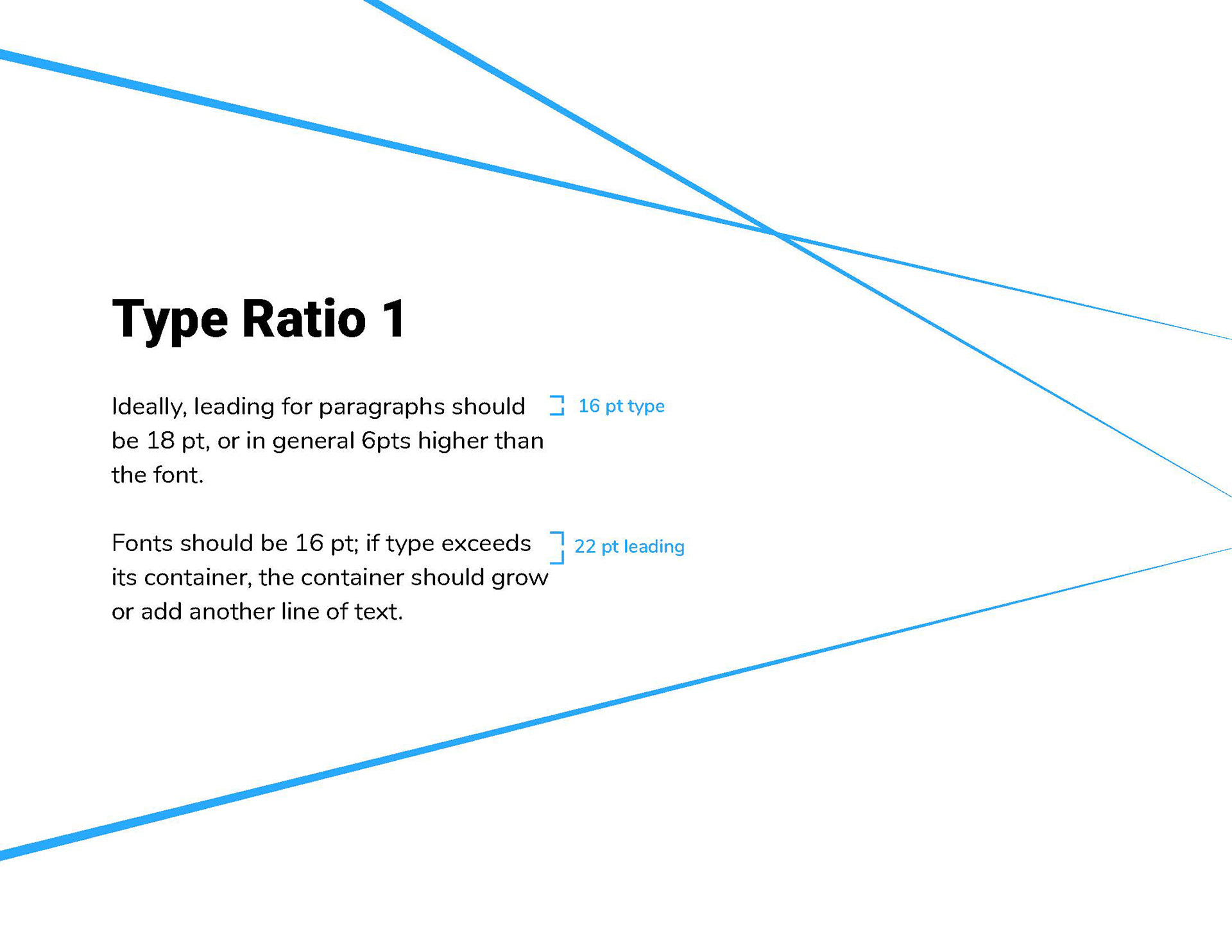
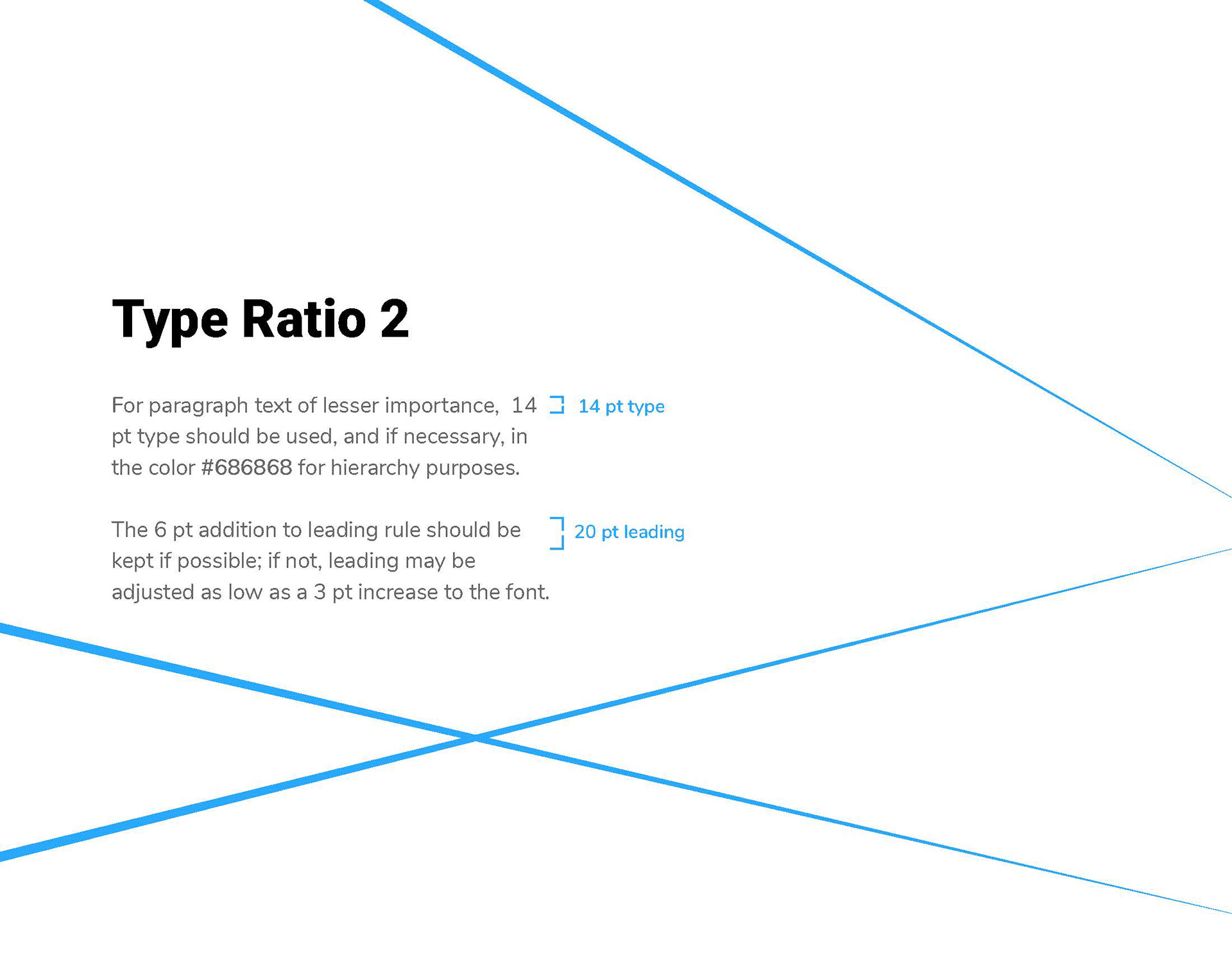
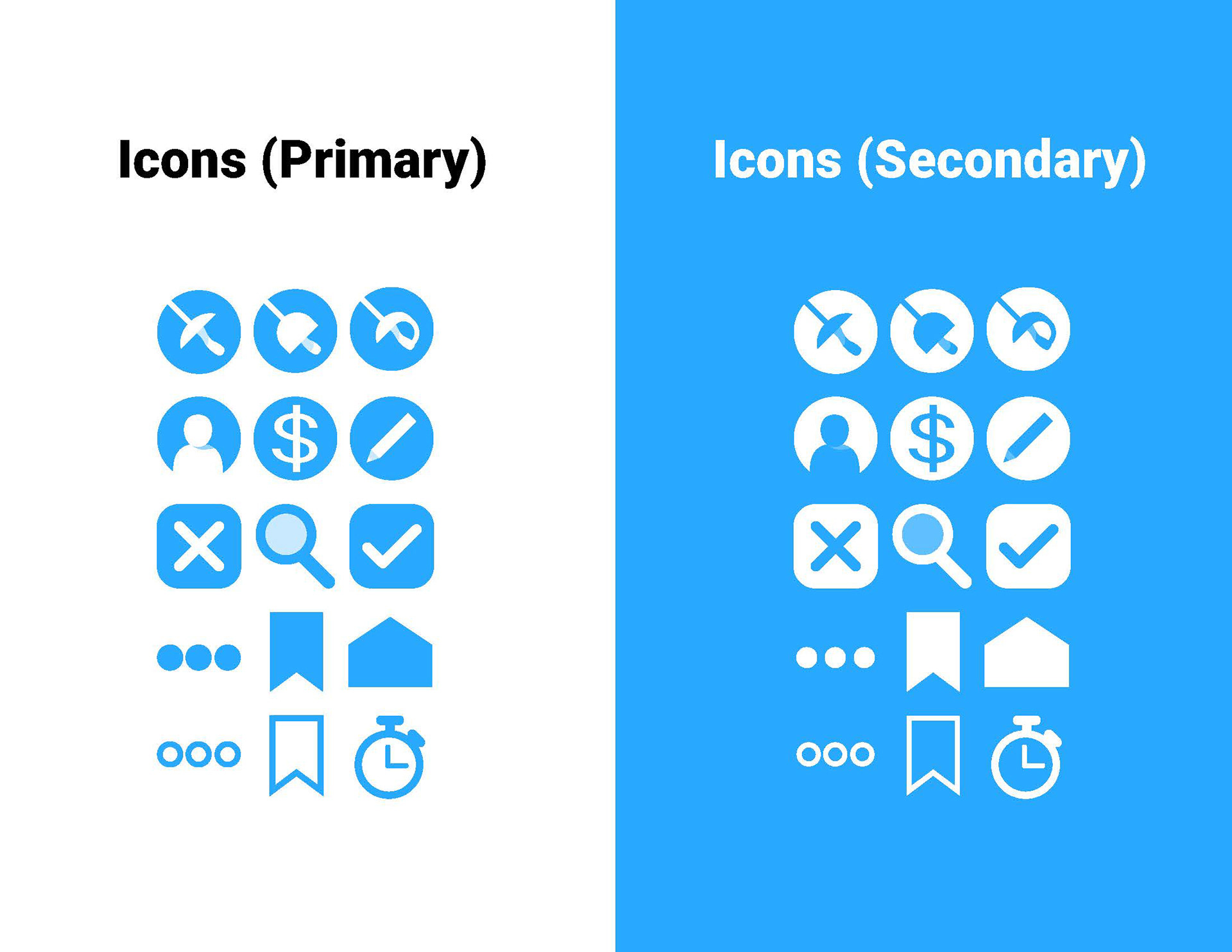
Style Guide
After creating these in greyscale, I decided to go in and add color. My biggest challenge at this stage was deciding on a cohesive style that captured the elegance of fencing as a centuries-old sport with the modernity of current-day fencing.
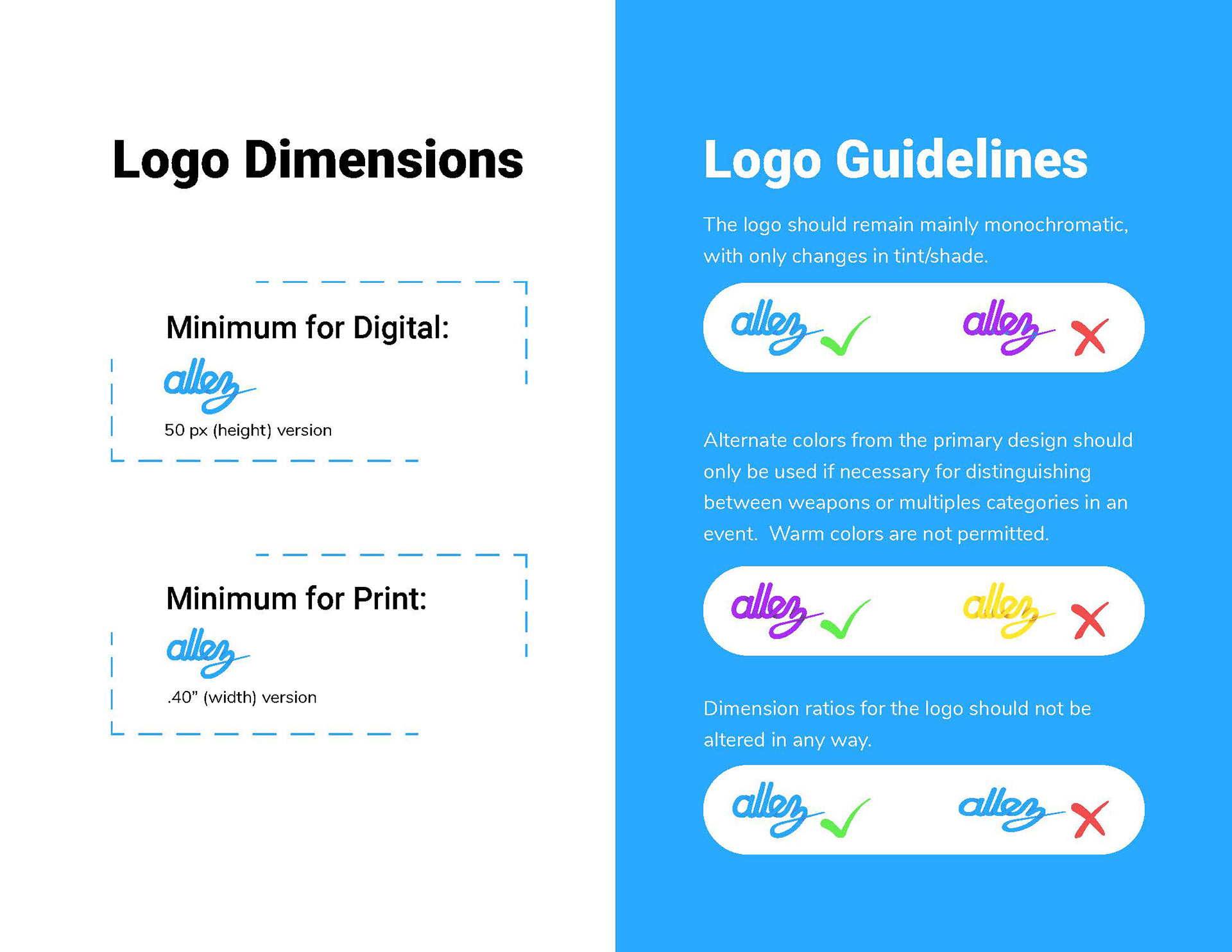
The final version ended up being fairly minimal (how fencers typically prefer) but with a bright color and tone in order to keep the app from being overwhelming for novice users.

Final Mockups
Here are the end screens that I designed (minus duplicate screens for most edit modes because they're so similar). I have so far tested the screens in as a cohesive system in Invision and am happy with the results, but will continue to refine the user experience through more A/B testing for specific screens.
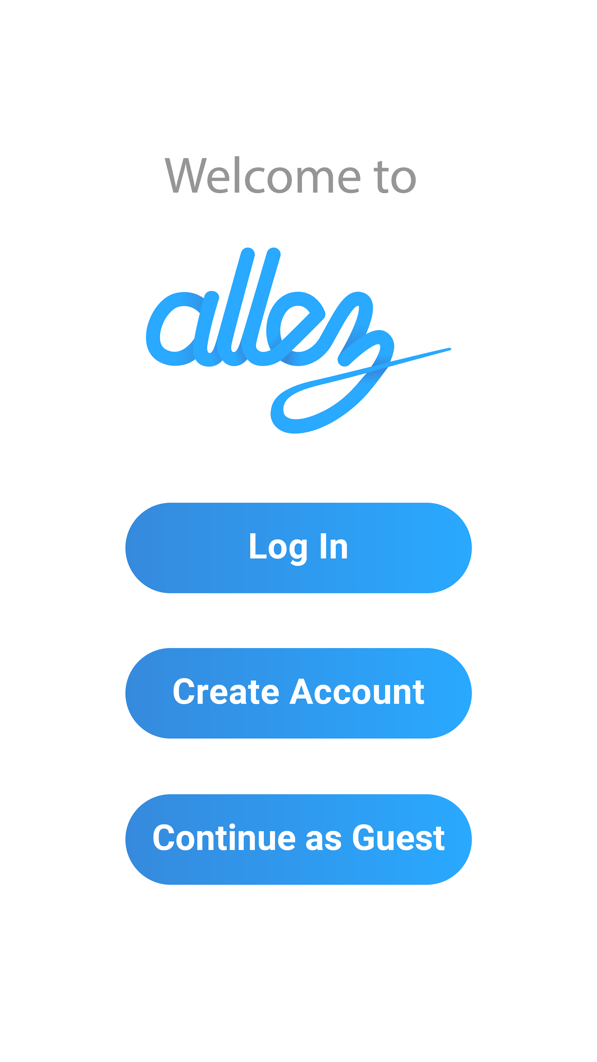
Initial Screen
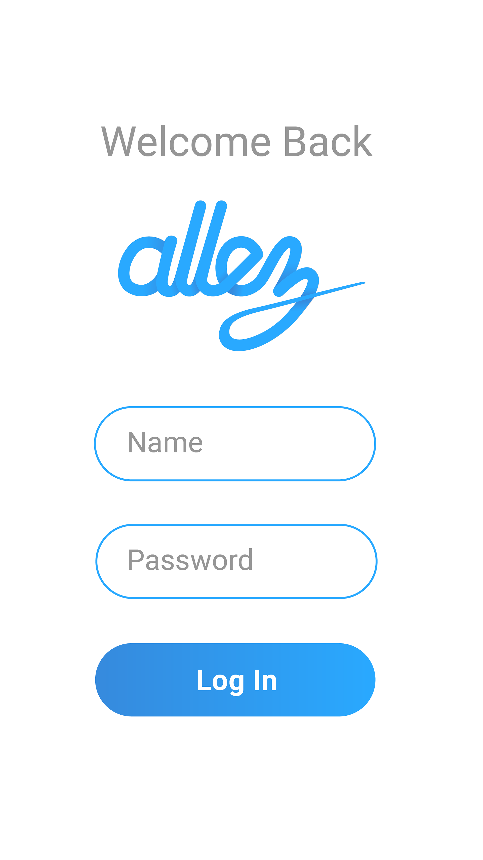
Log In
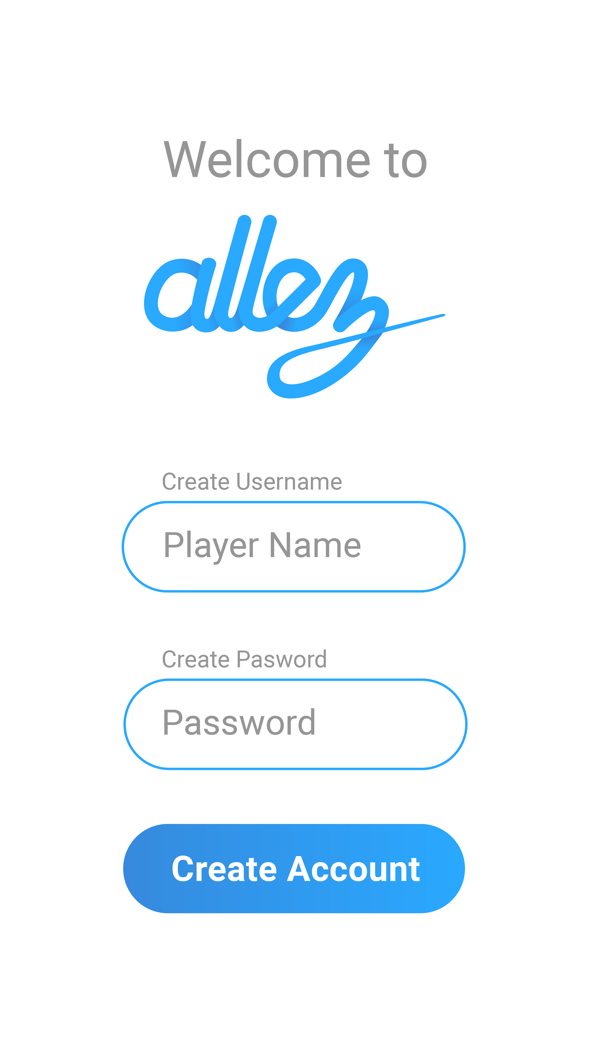
Sign Up
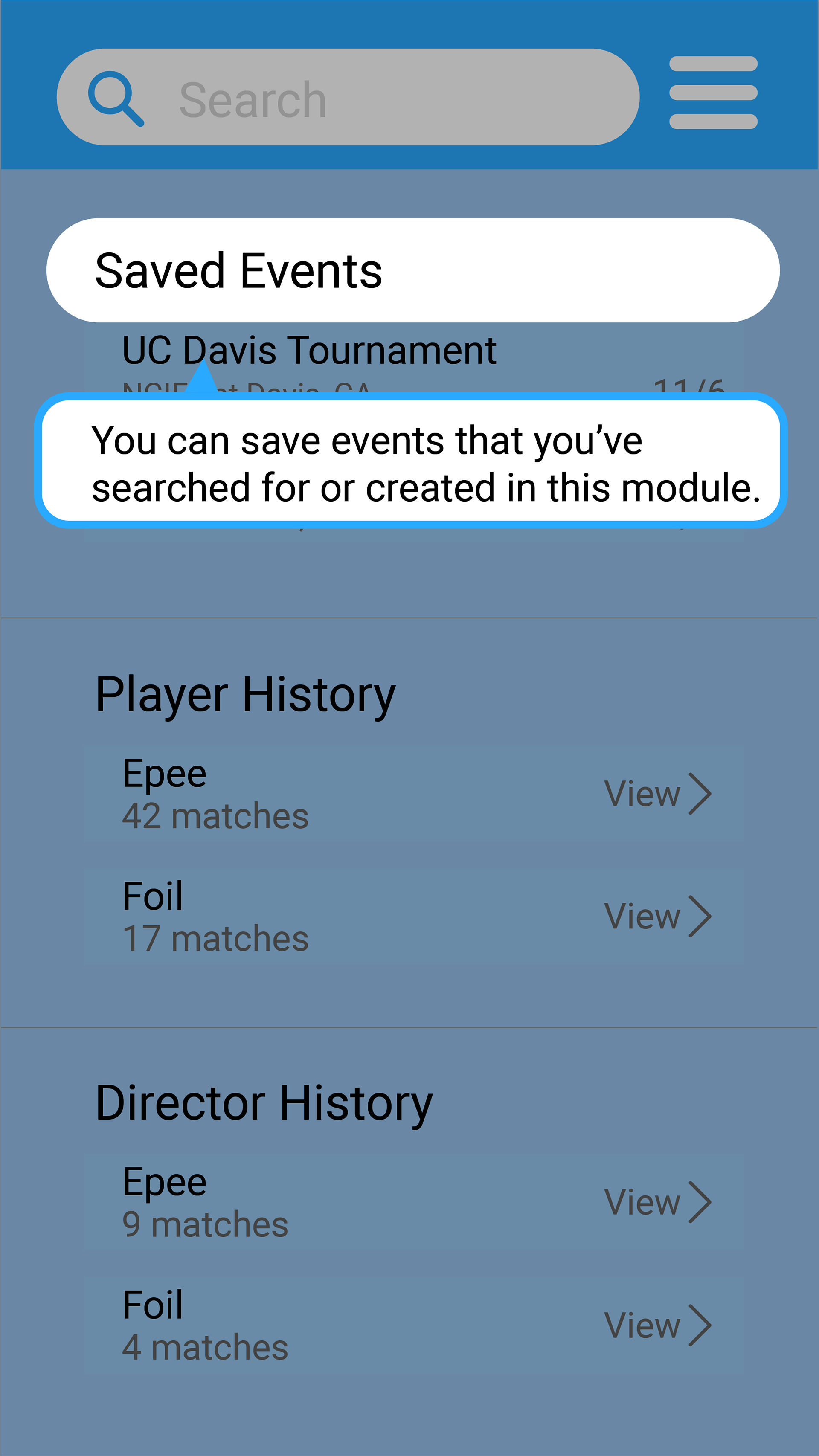
Intro to Events
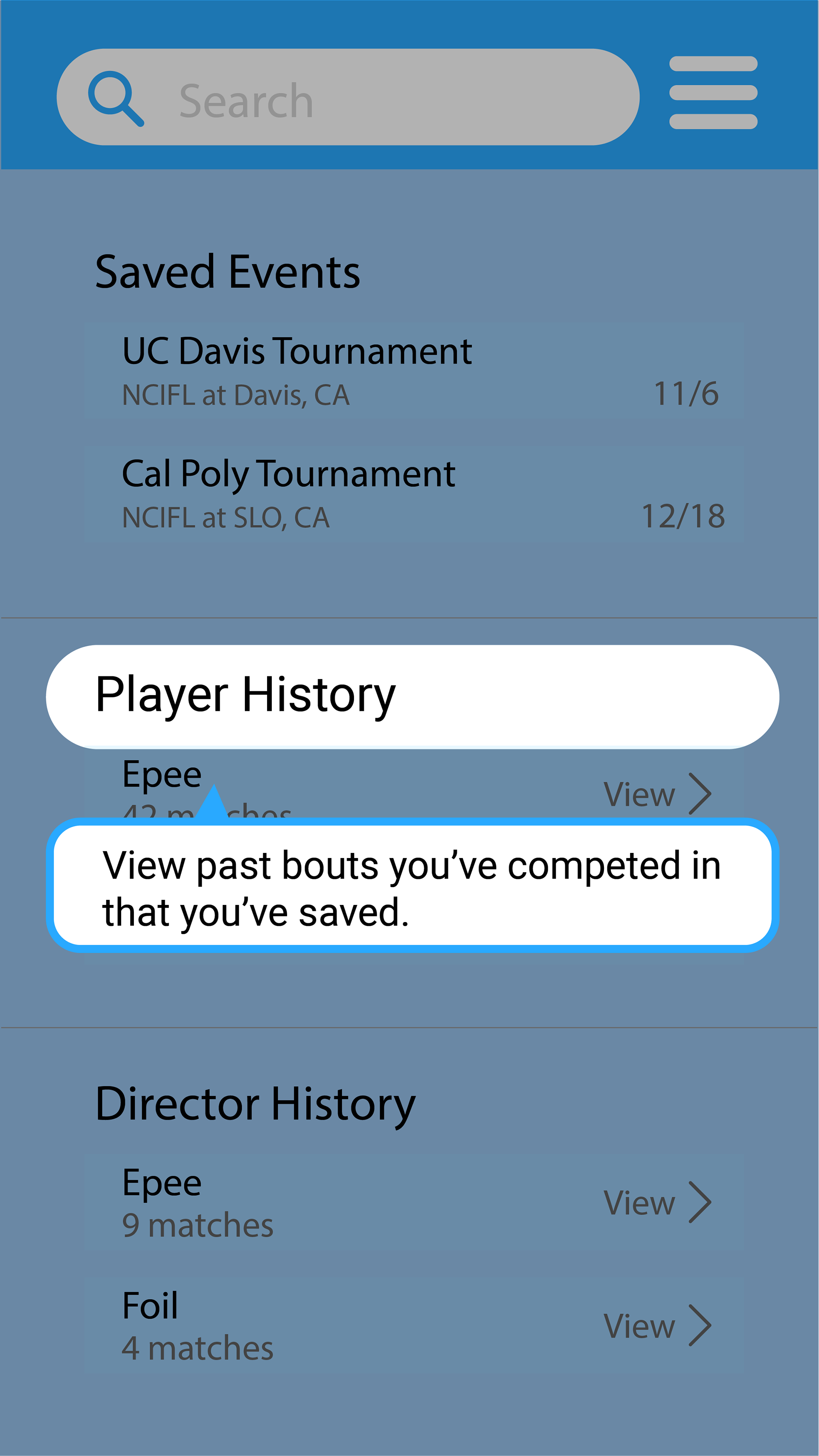
Intro to Player History

Intro to Director History

Navigation Menu
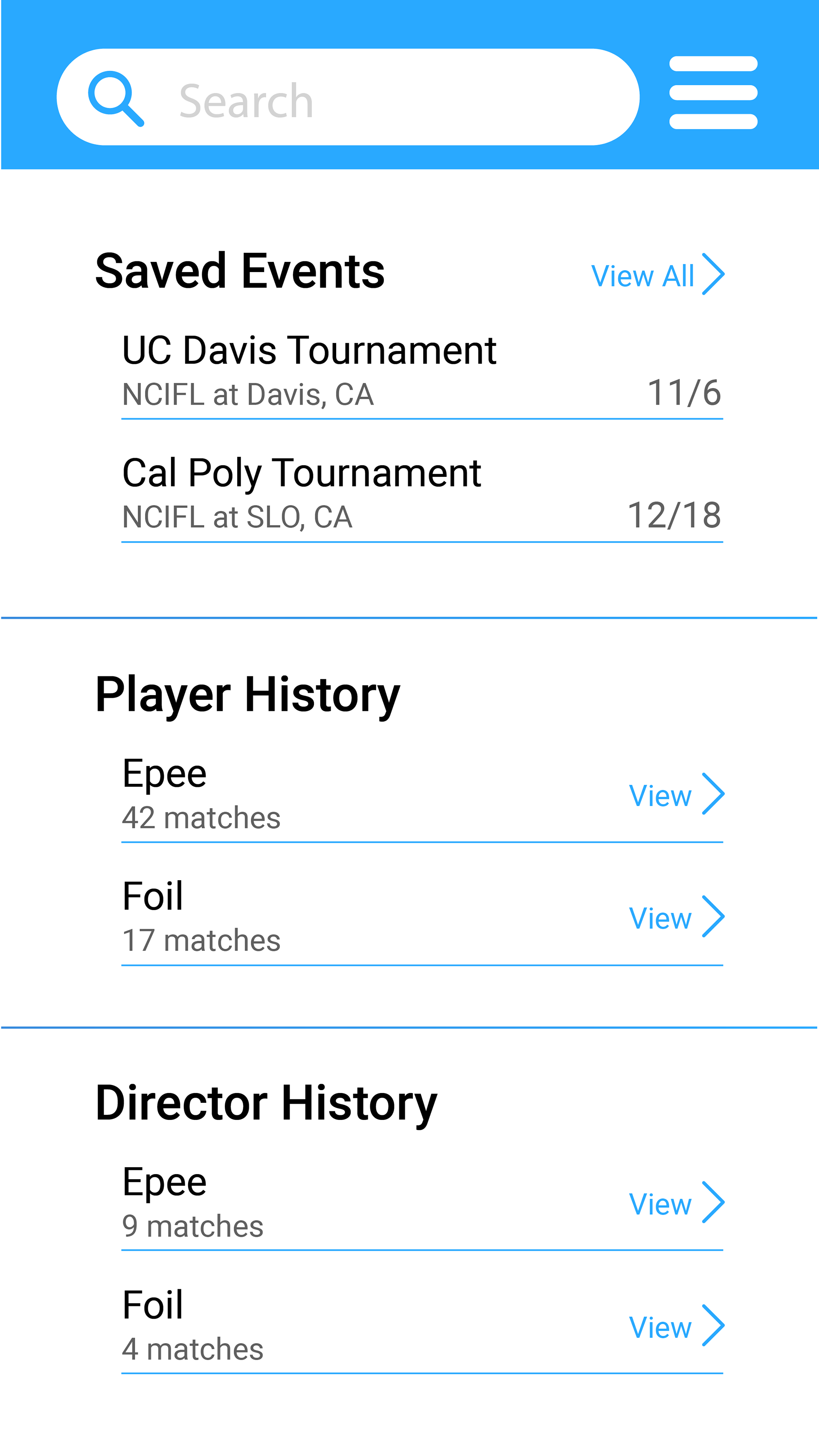
Main Page
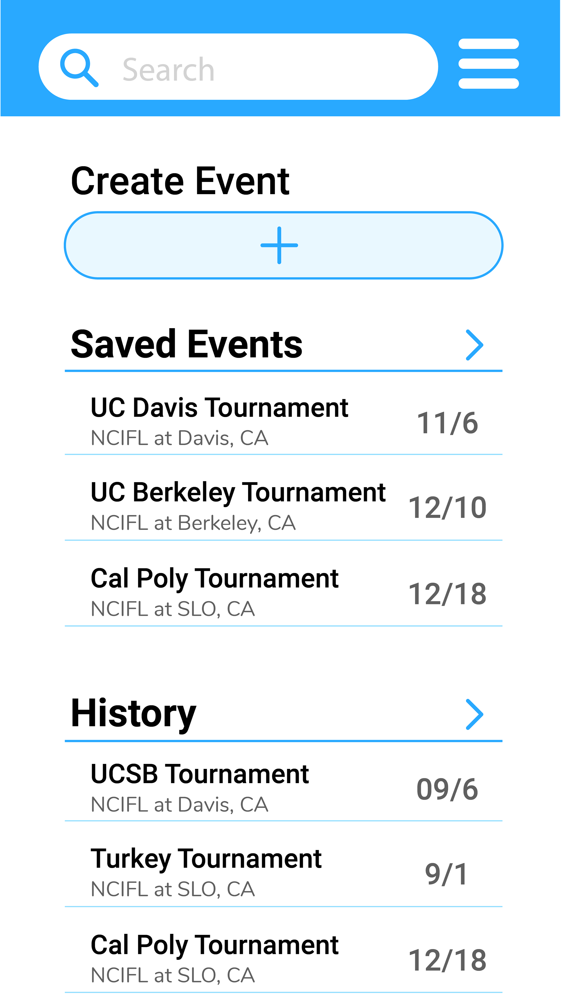
Events Page
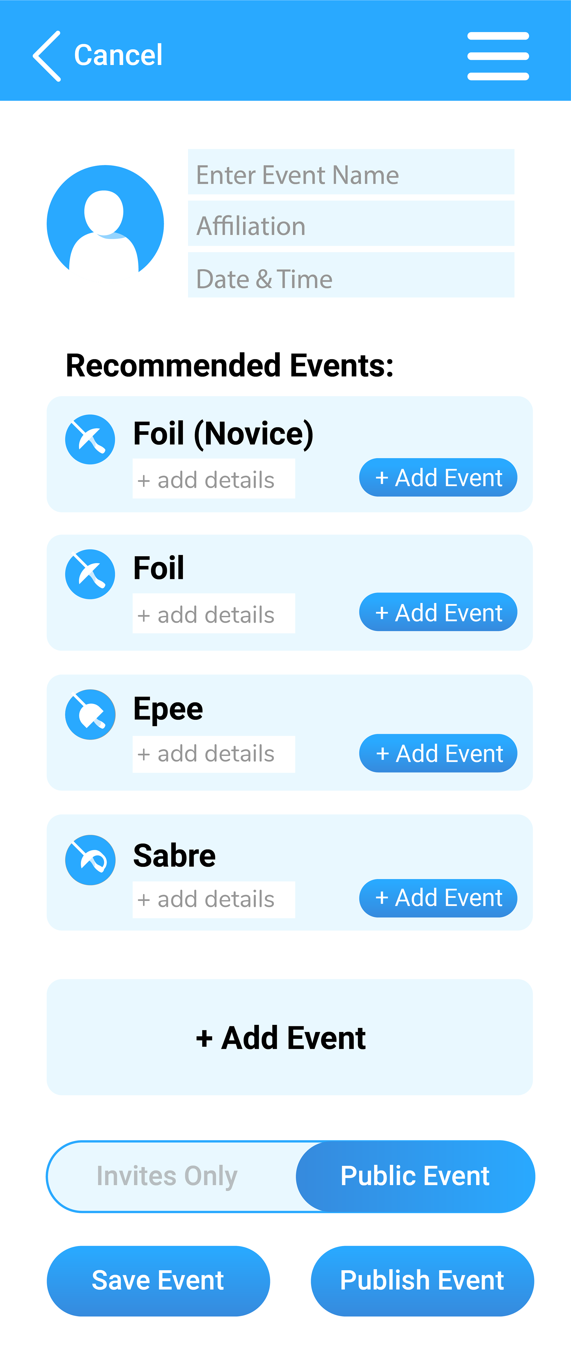
Create Event

Tournament Details
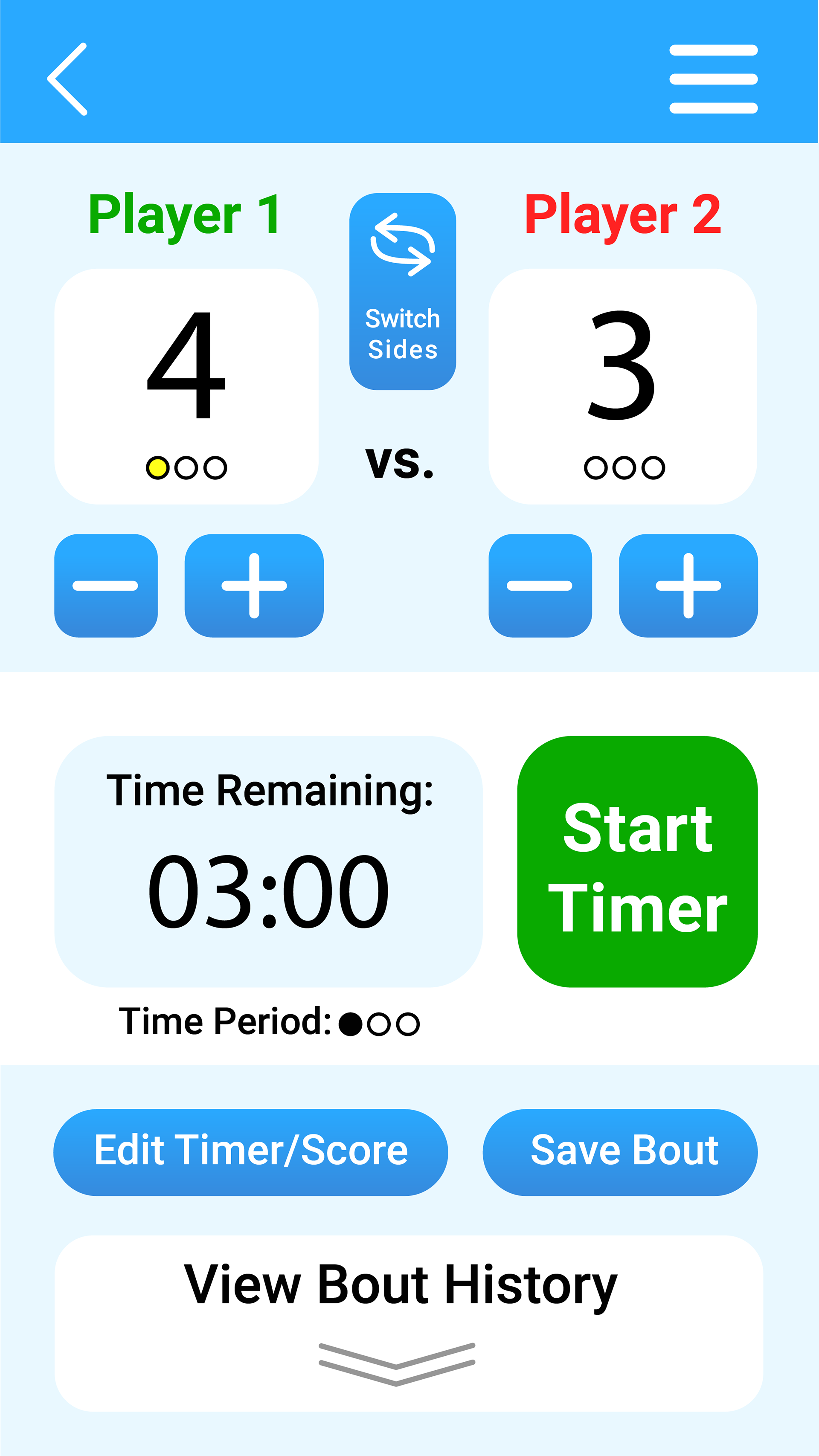
Timer (Inactive)

Timer (Active)

Timer (5 seconds or less left)
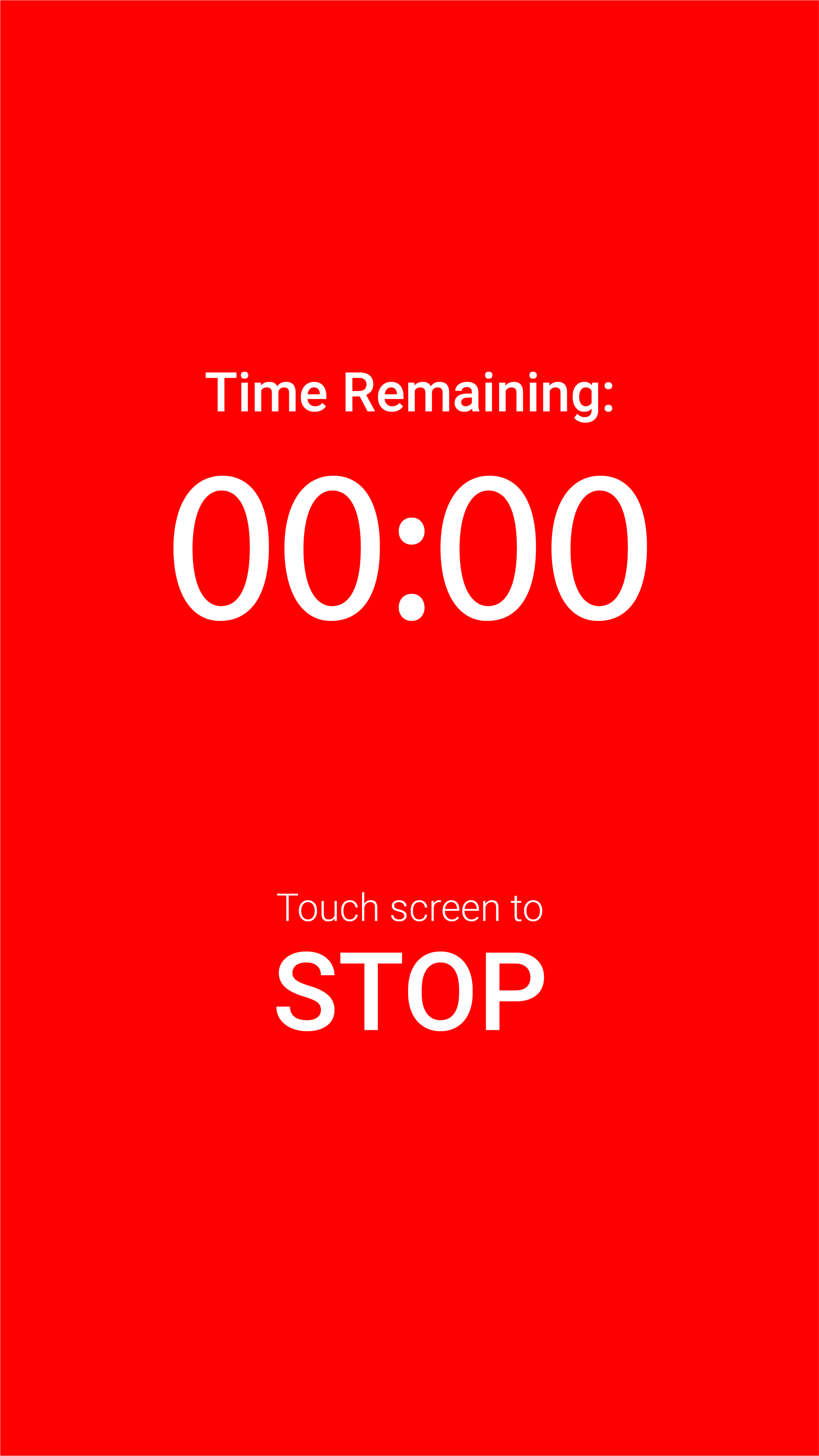
Timer (Ended)

Tournament Player Verificationg
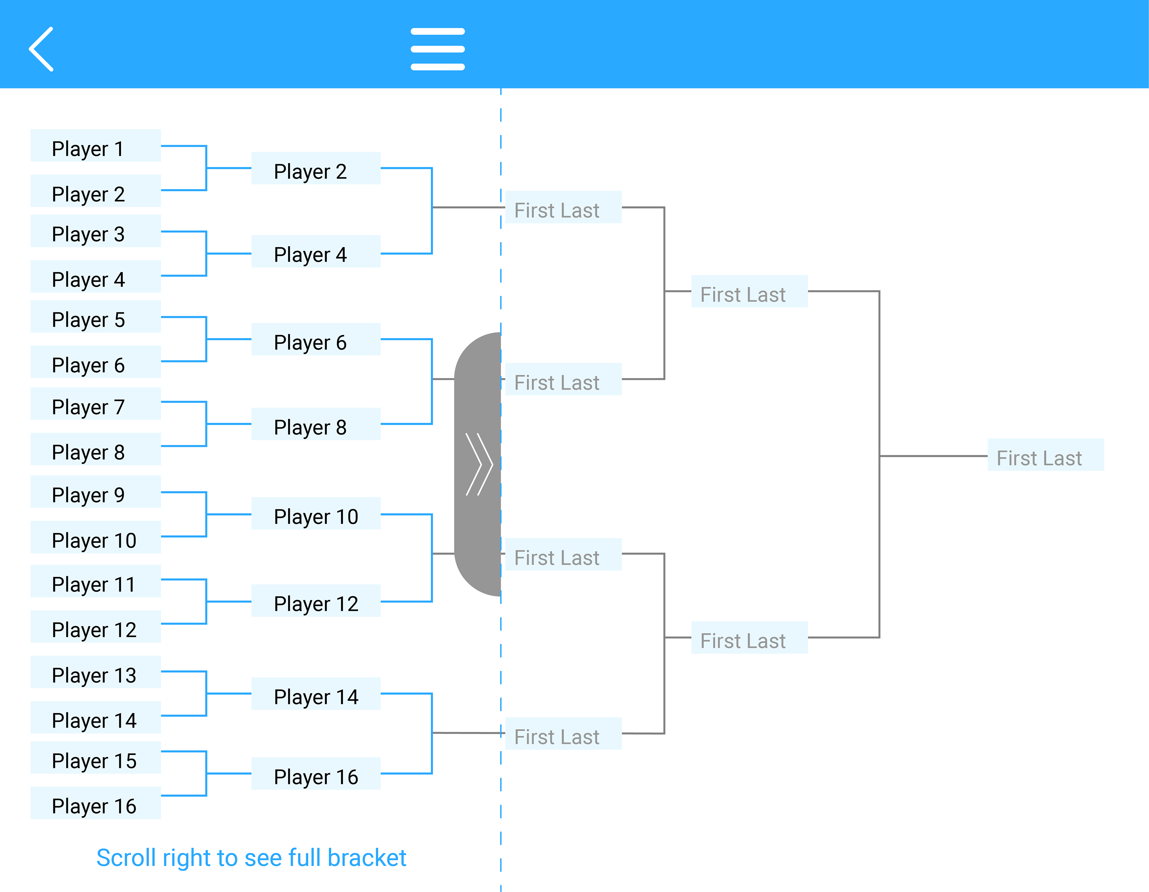
Tournament Bracket

Timer Log (Edit Mode)Score History (Editable)
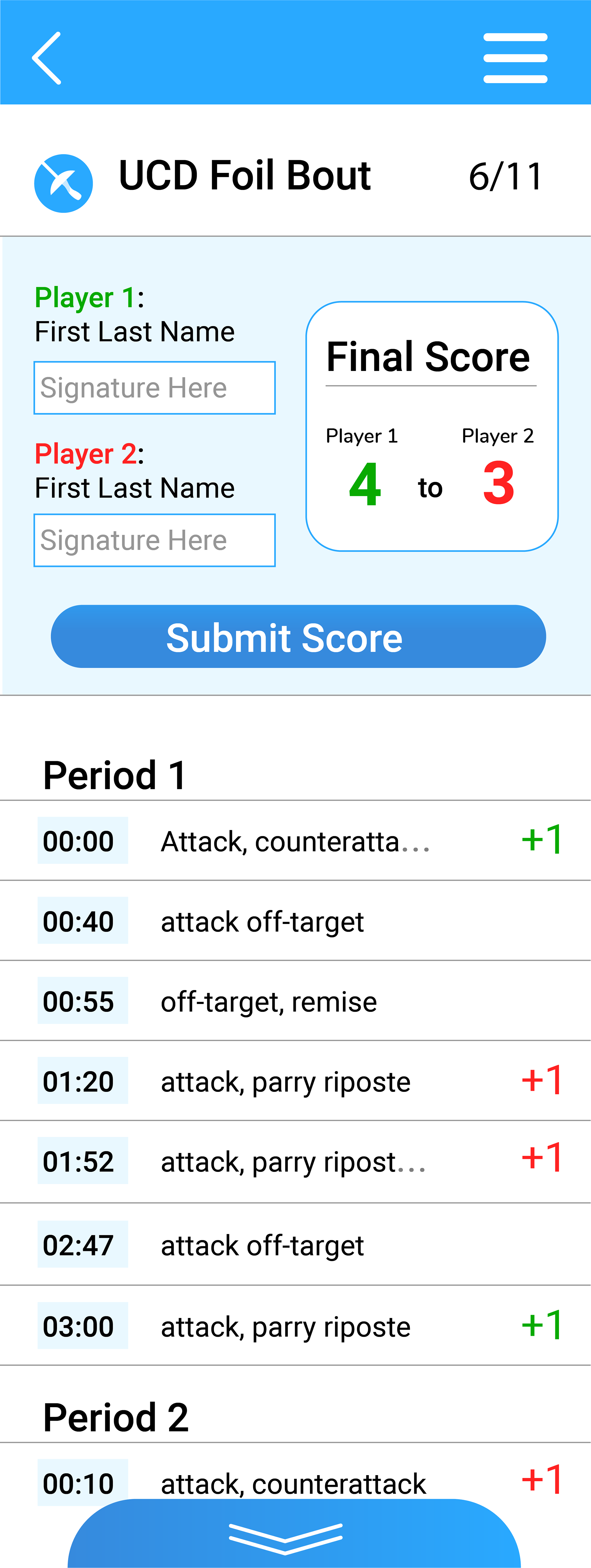
Director Match (to be submitted)
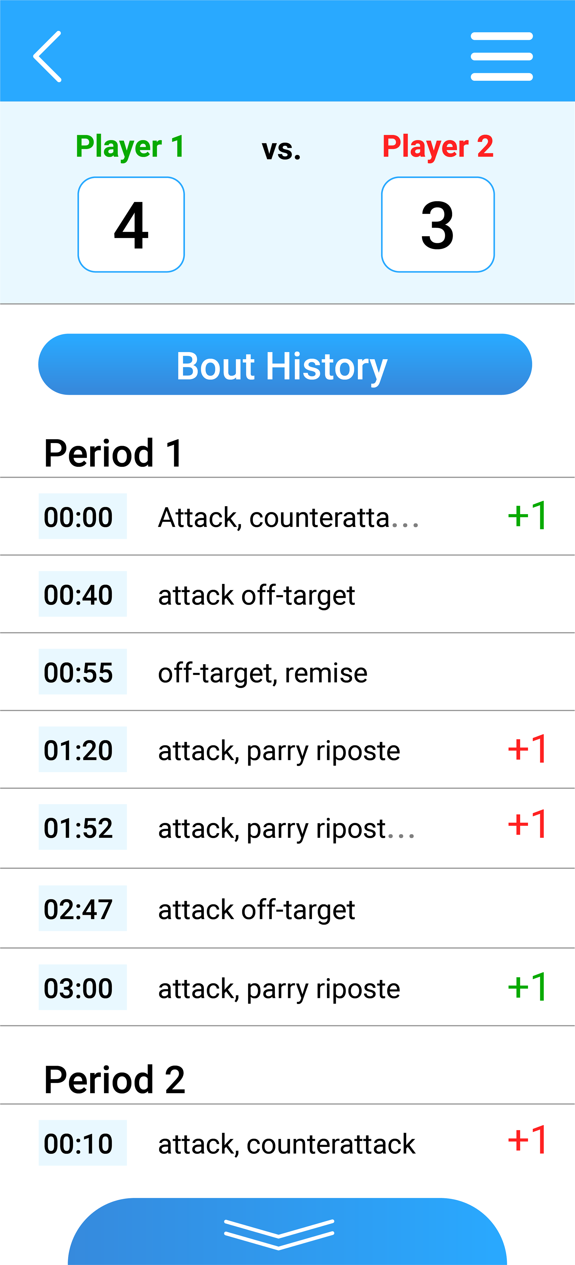
Director Match
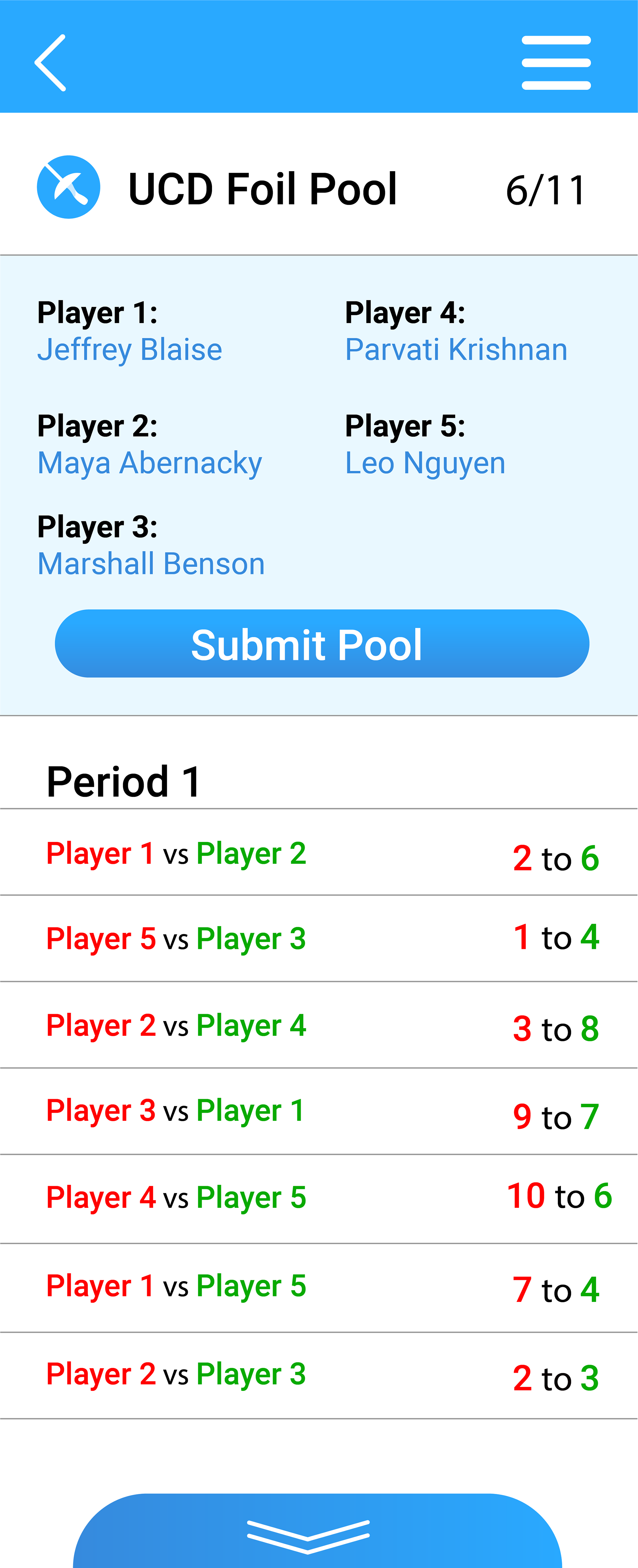
Director's Pool (to be submitted)
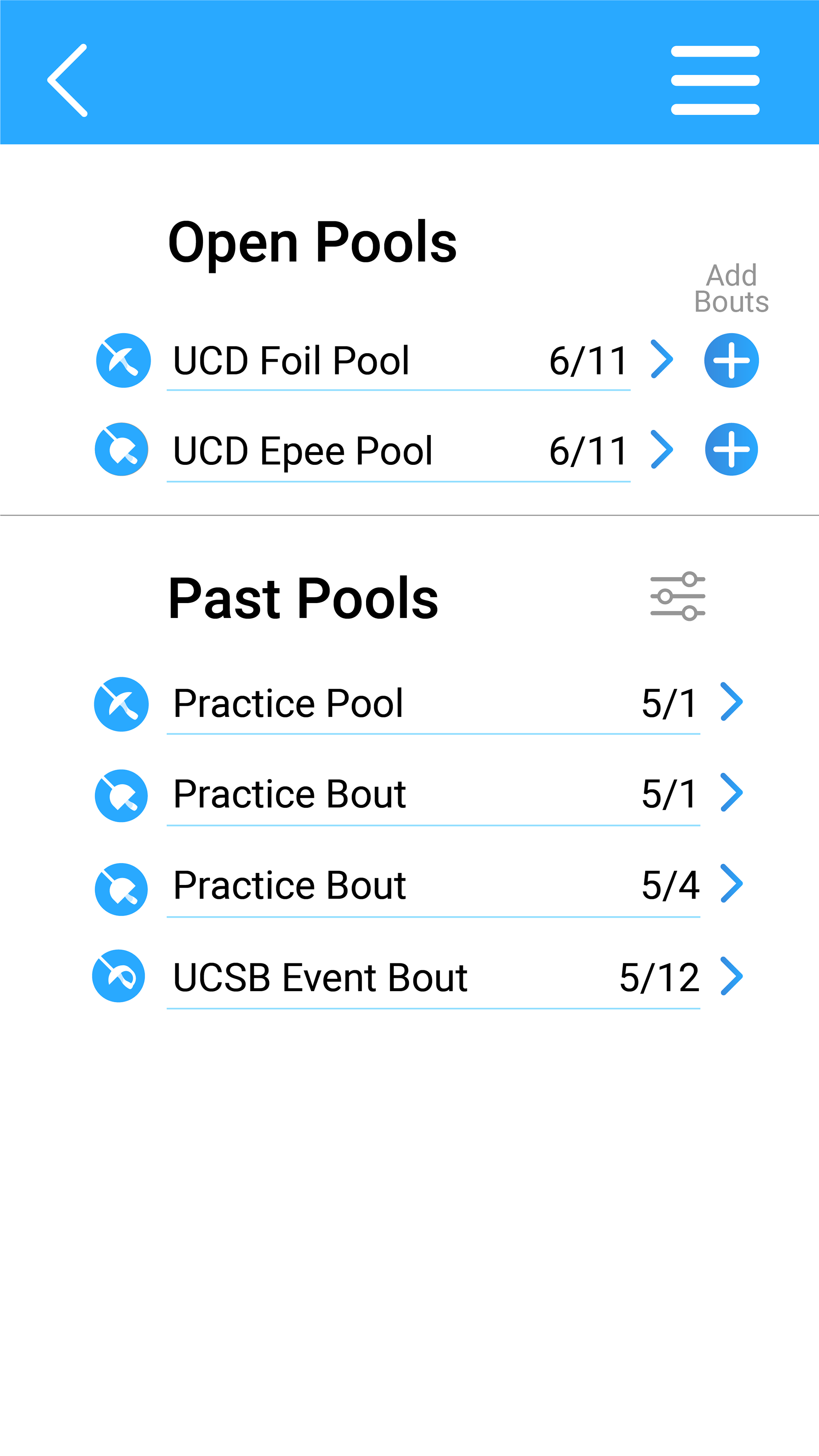
Director's Pools List
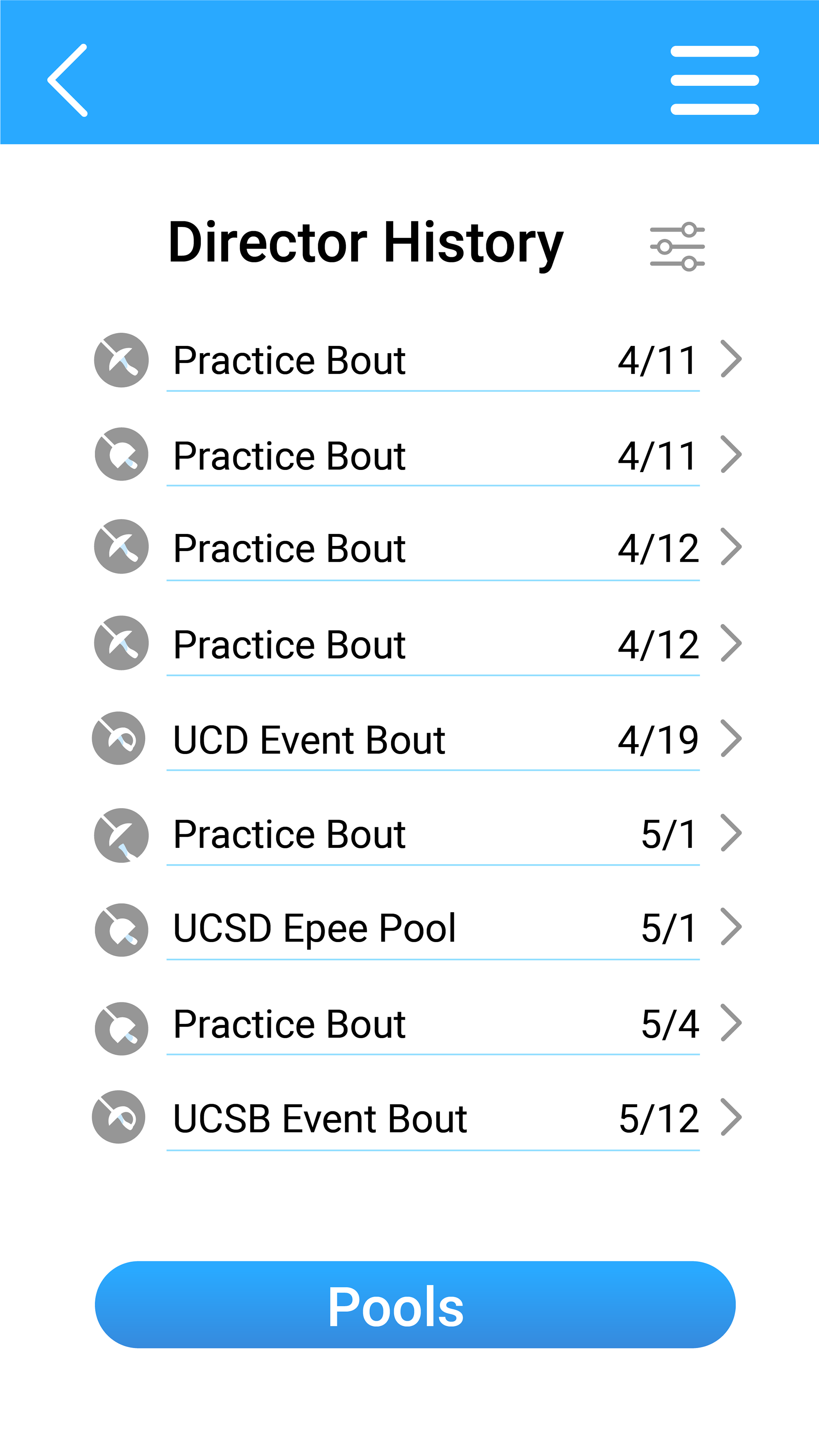
Director History Log List
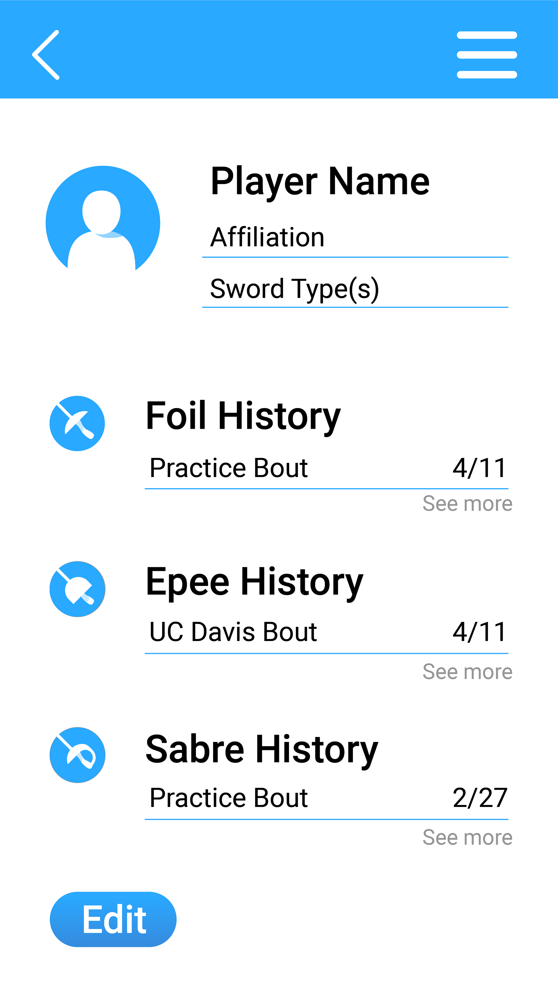
Player Profile

Player's Sabre Match History
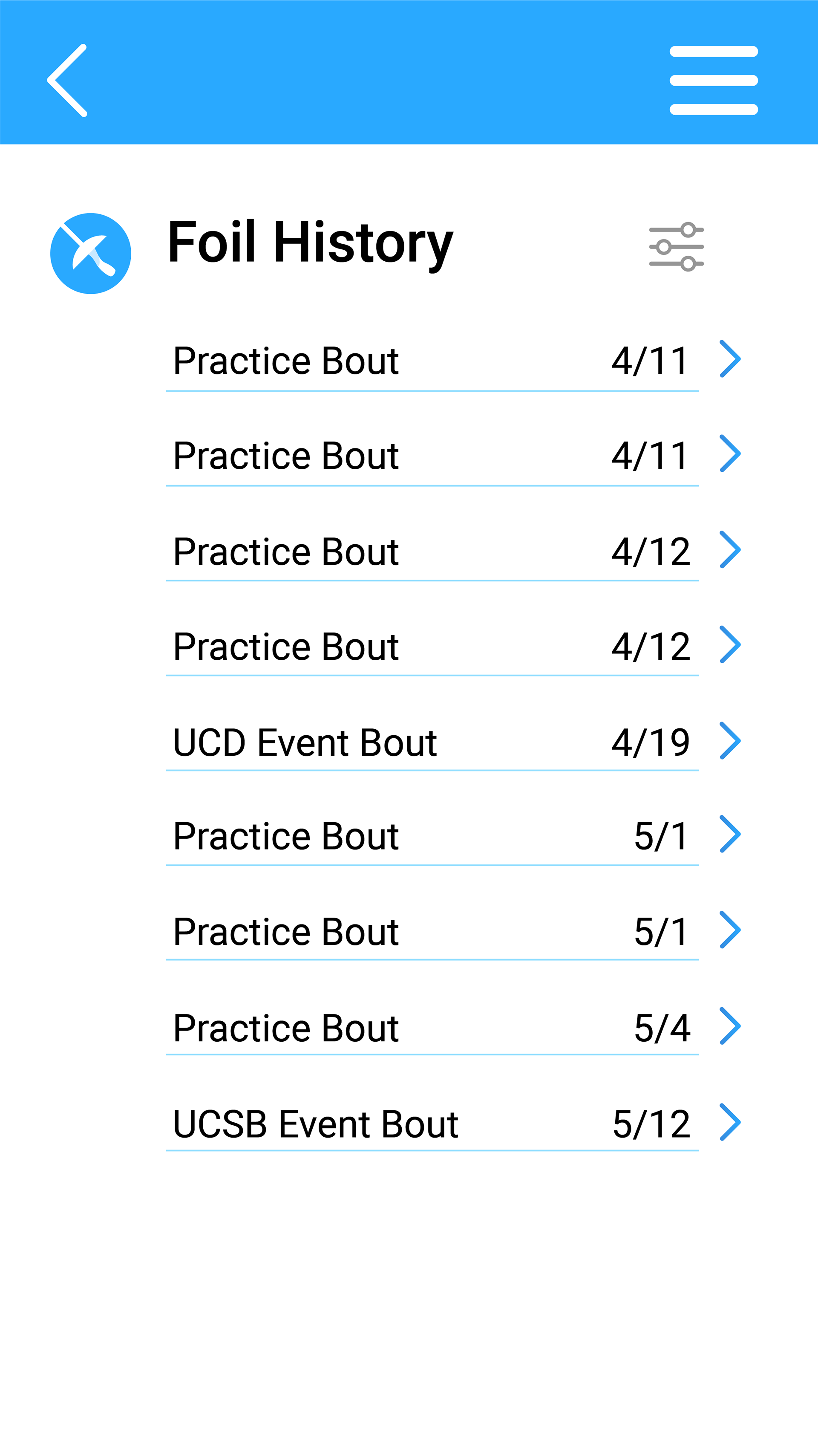
Player's Foil Match History
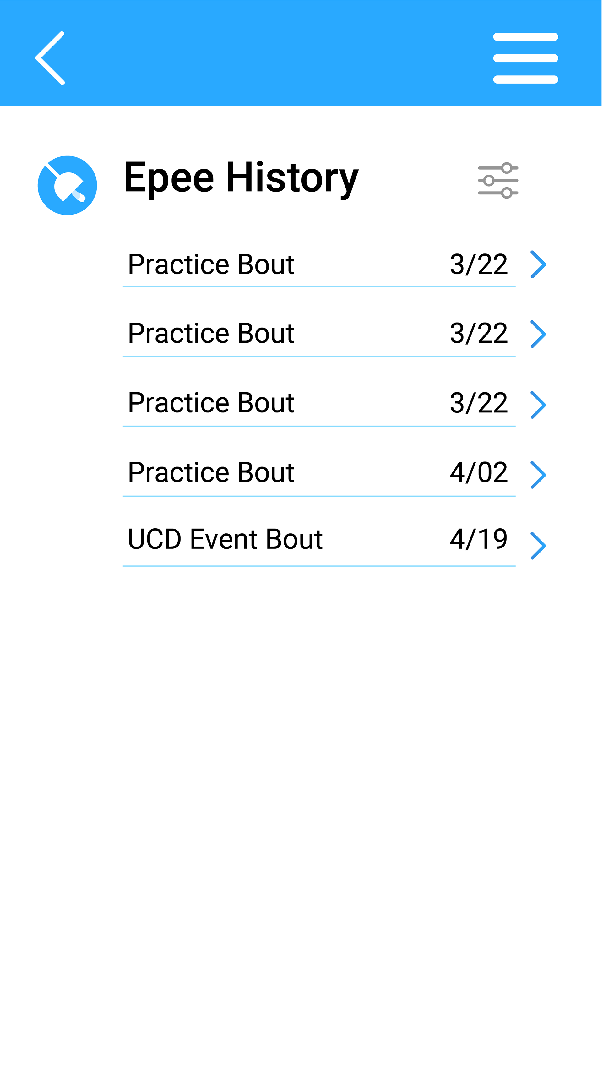
Player's Epee Match History
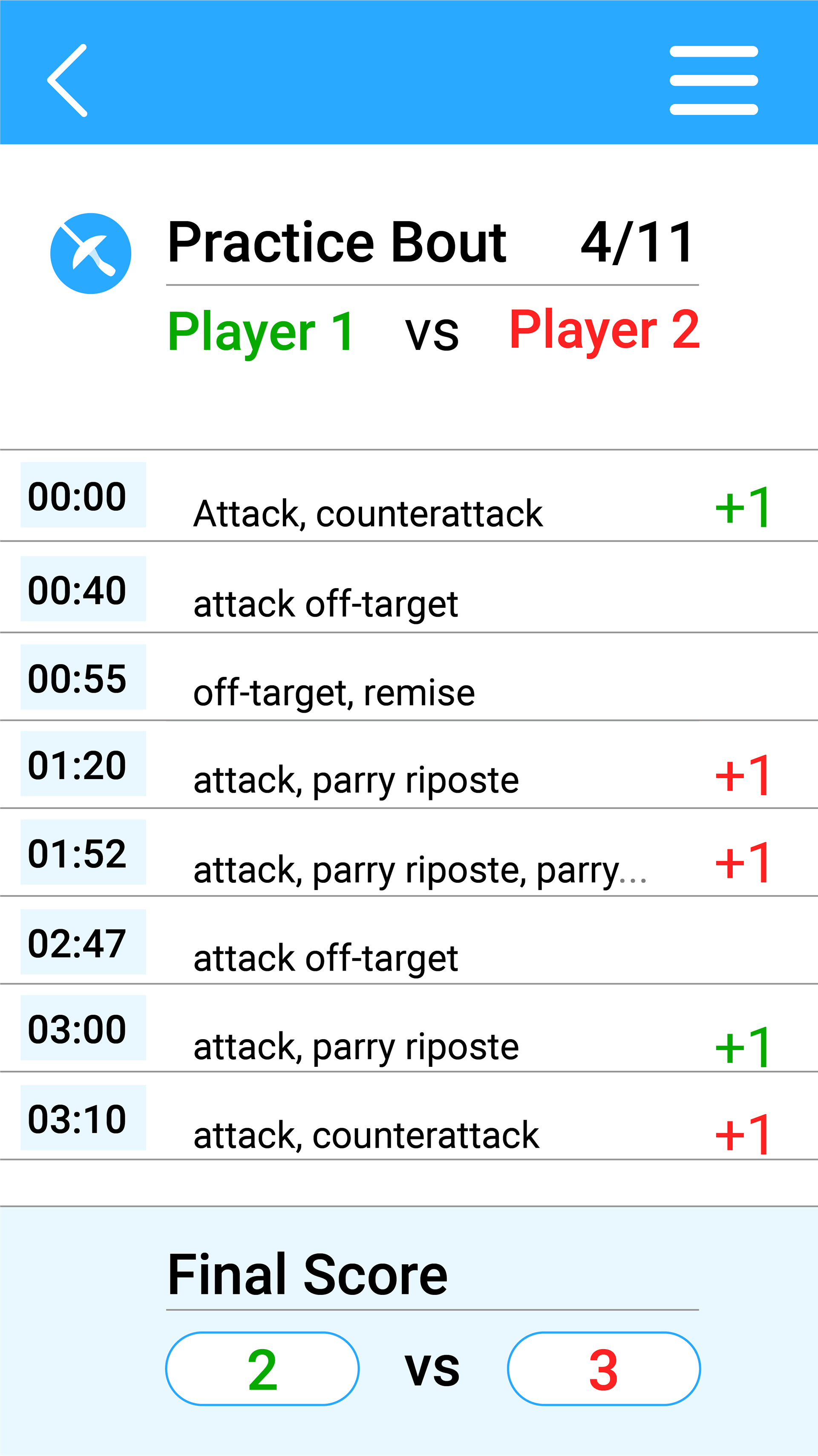
Player Match Log
Conclusion
Thank you for reading this far into my project! I had a lot of fun with this as my first complete app design (on my own). While I found finalizing the site map structure to be my hardest challenge, I learned a lot about the myriads of ways a designer can present the many aspects of a tournament, and how to refer back to how the majority of users will think and operate the app.